Strategy and Goals
The responsive email design project began as an initiative to make Sephora's emails more mobile-friendly, but quickly grew to involve a design revamp of global elements on all emails, in addition to a larger look at the strategy and goals of each specific email type.
Below, you'll see the evolution of the global header and footer, Value Sets email template, New At Sephora email template, and Point Boutique email template. These represent three top-performing franchises whose design and experience we wanted to streamline.
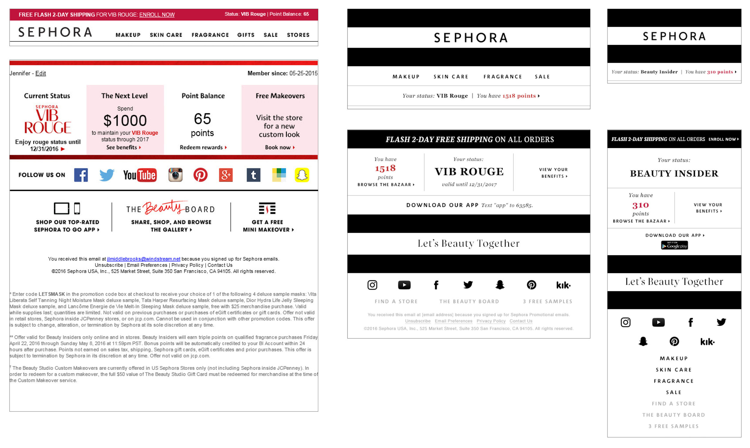
Headers, Footers, and global elements
Sephora's legacy header, footer, and Beauty Insider point information shown on left, Updated desktop and mobile headers, footers, and Beauty Insider point information shown on right.
Value Sets Email Template
This design was developed with the following goals in mind:
1. Transition the email to a responsive design to ease workload.
2. Create a stronger, easily recognizable header for the franchise.
3. Elevate the design to shift away from feeling inexpensive or unsophisticated.
Art direction and typographic inspiration for the Value Sets template.
Legacy Value Sets email template examples.
Updated Value Sets email template.
New At Sephora Email Template
This design was developed with similar goals to the Value Sets template, with the focus shifted to the client's excitement around newness and wanting to see as many new products as they can.
Legacy Newness email designs.
Updated New At Sephora email template.
Point Boutique Email Template
The Sephora Beauty Insider Rewards program is another major draw for clients. With this in mind, the point boutique emails were redesigned with updated reward imagery to again elevate the experience for the client and increase the excitement around the wide range of offerings.
Legacy Point Boutique email design.
Updated Point Boutique email template.


